We have all been there. You are at a conference in Sydney, trying to network, but you end up squinting at someone’s chest, trying to decipher event name badges that scream ‘someone panicked in Excel and hit print.’
Awkward 😬.
Event name badges should make conversations easier, not turn every introduction into an eye test.
Poorly designed event name badges lead to confusion and missed connections. At the end of the day, there is a giant bin filled with single use plastic badges and synthetic lanyards, all destined to sit in landfill for the next 500 years.
This is your definitive guide to designing event name badges that actually work.
We will walk you through a simple, step by step process for creating an event name badge that is visually stunning, easy to read, and made from materials you can be proud of. Whether you are an EA, office manager, event planner or comms lead, this is your playbook for creating professional name badges and event name badges that stand out for all the right reasons.
While this guide covers the essential principles of great event name badge design, if you want a detailed breakdown of layouts, wireframes, and where to place every element, we have built a complete guide on the anatomy of a perfect name tag.
Who This Guide Is For
The Practical Planner
You need actionable steps and an event name badge template that works now.
The Brand Guardian
You need custom name badges and professional event name badges that reflect your company’s quality and values.
The Sustainability Champion
You need eco friendly event name badges that do not compromise on design.
Pressed for time? Here are your quick wins:
Readability is King: Make the first name at least 48pt in a clean, sans serif font.
Hierarchy is Everything: First Name > Company > Job Title.
Stop the Flip: Use double sided printing or a dual clip lanyard.
Ditch the Plastic: Plastic name badge holders and synthetic lanyards sit in landfill for 500 years 😱. Choose thick recycled paper or seed paper for sustainable event name badges that feel considered.
1. The “Why”: Event Name Badges Strategy and Psychology
Before you open a template, let us define the mission. A name badge has three psychological jobs:
To Reduce Social Friction: It removes the awkwardness of forgetting names and helps people connect confidently.
To Act as a Brand Ambassador: It is a wearable piece of your brand’s reputation. Quality materials signal a quality event.
To Guide Behaviour: It can identify speakers, staff or VIPs, provide simple wayfinding, and even spark conversations.
A few minutes of planning here will save hours later.
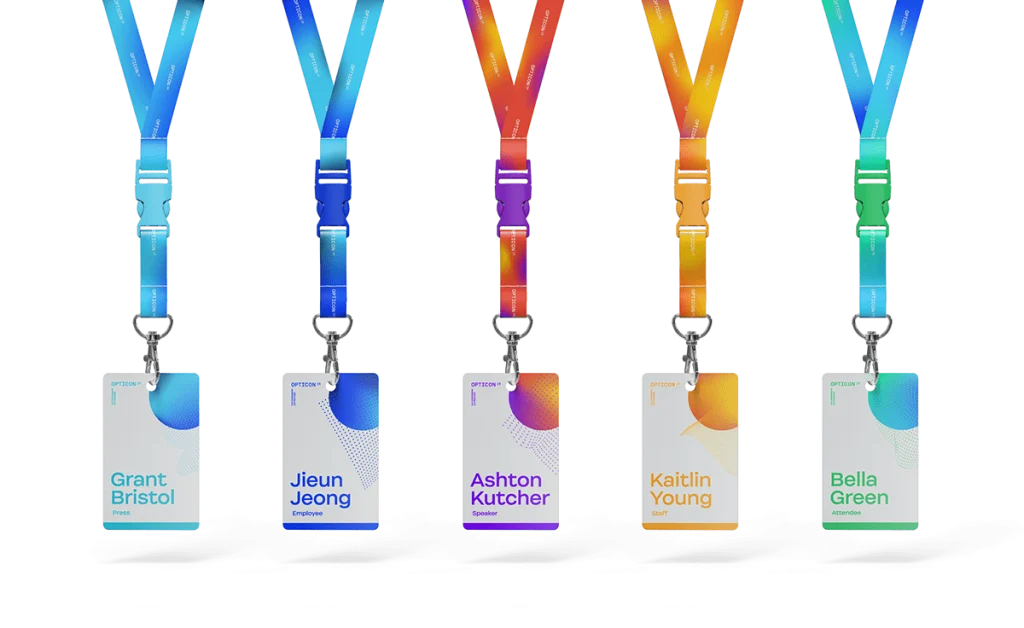
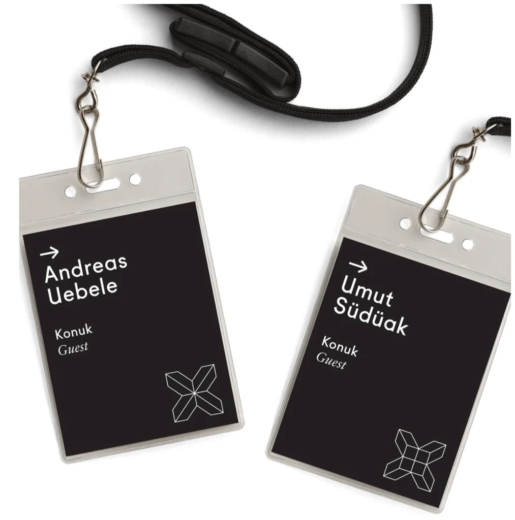
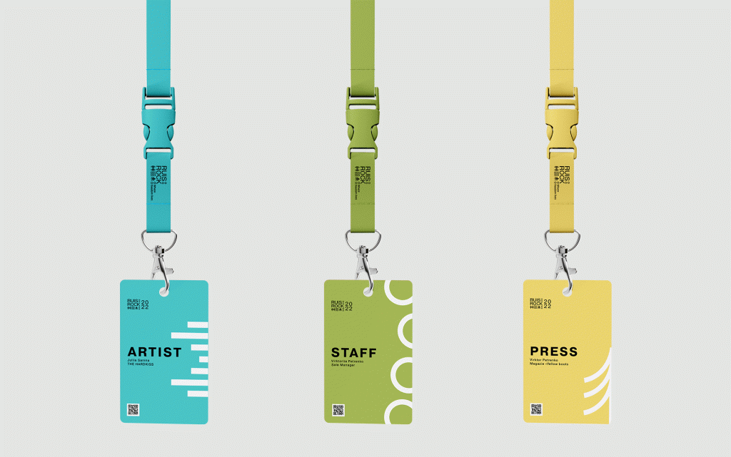
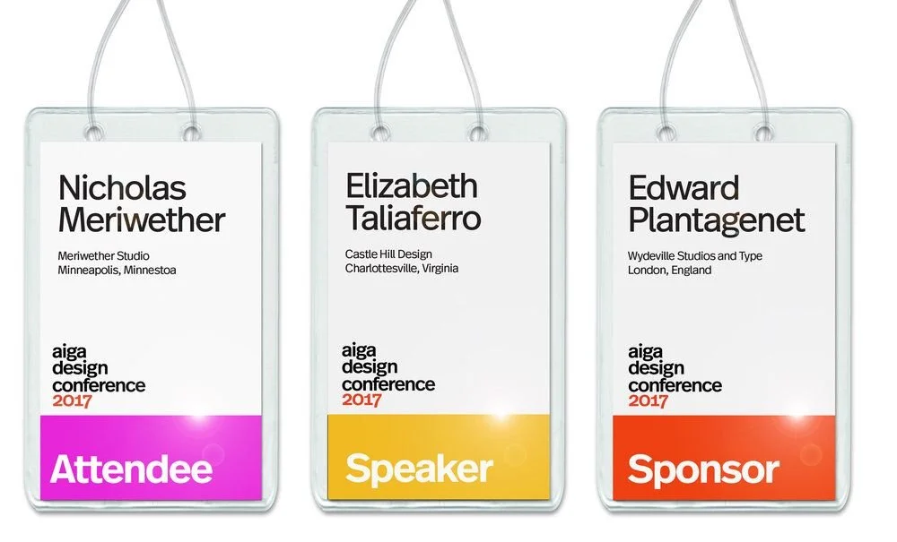
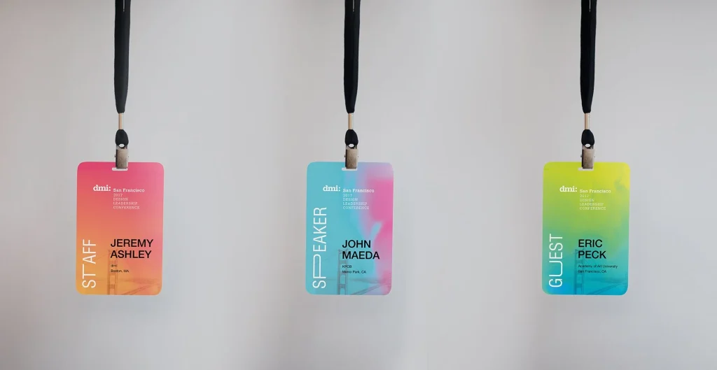
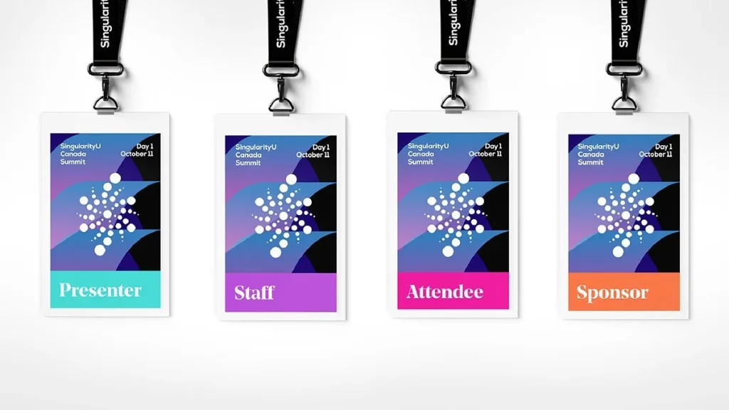
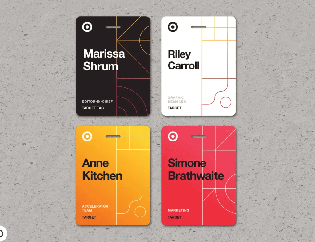
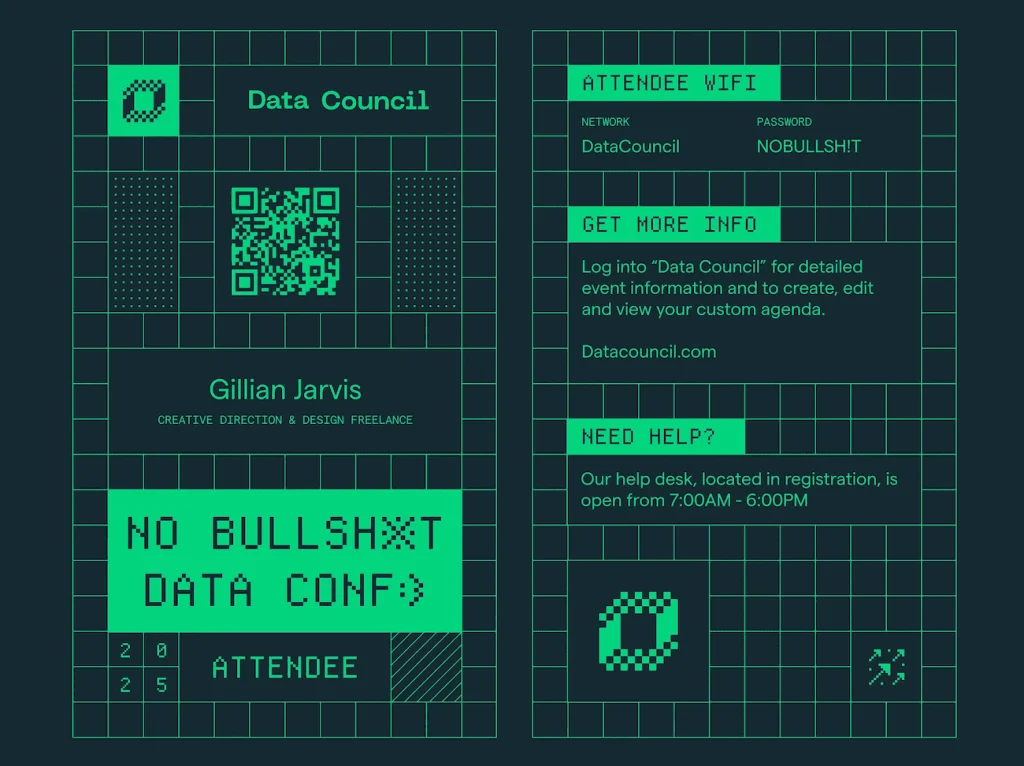
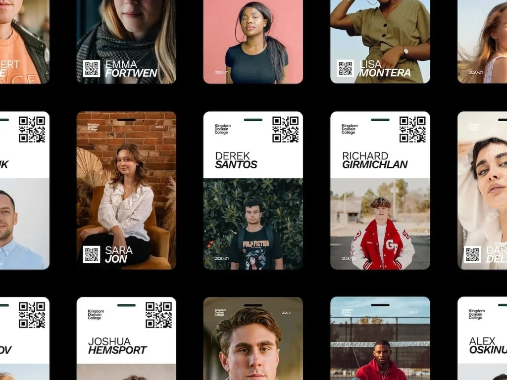
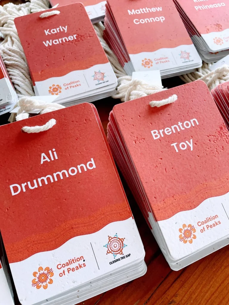
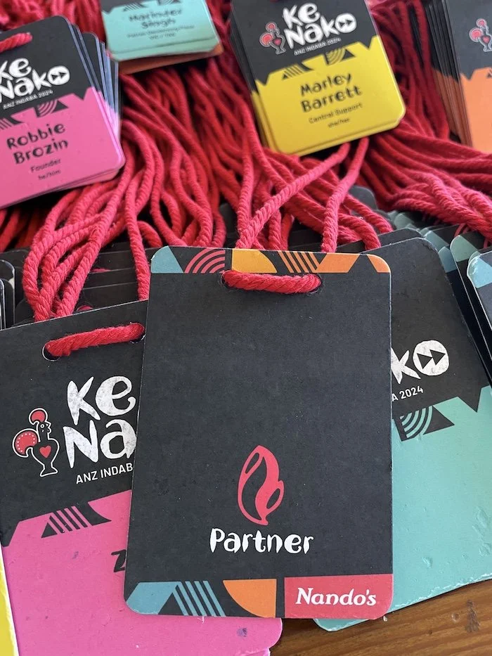
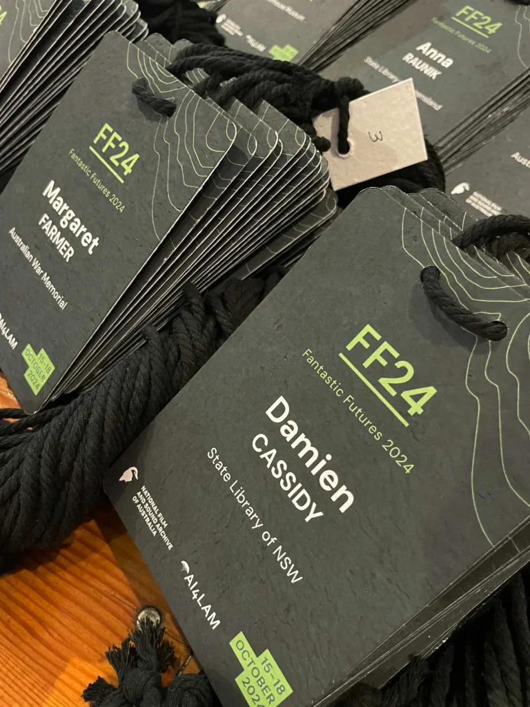
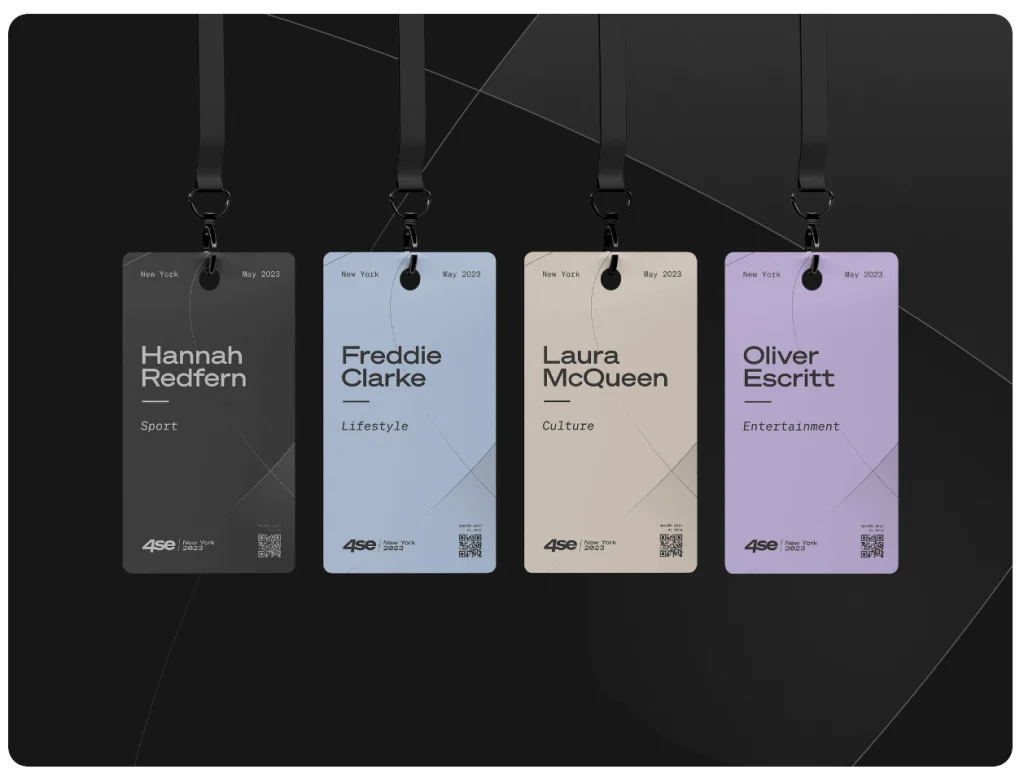
2. The “What”: A Lookbook of Event Name Badges
Here is a curated gallery of concepts to inspire your event name badges design.
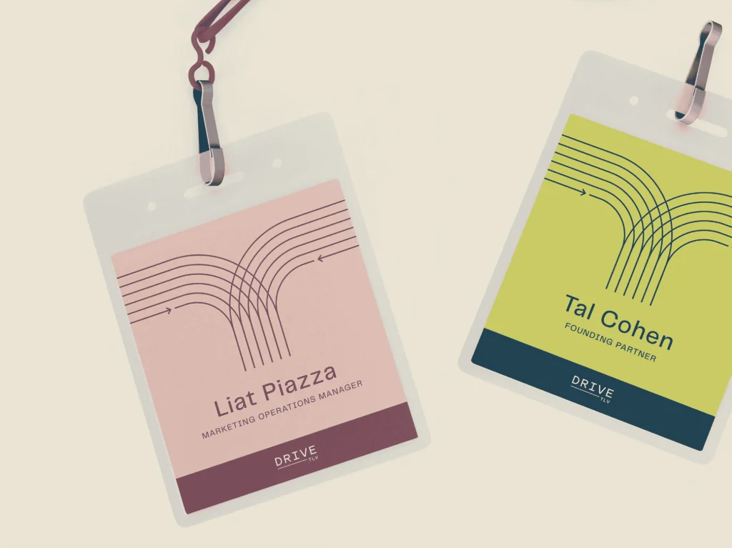
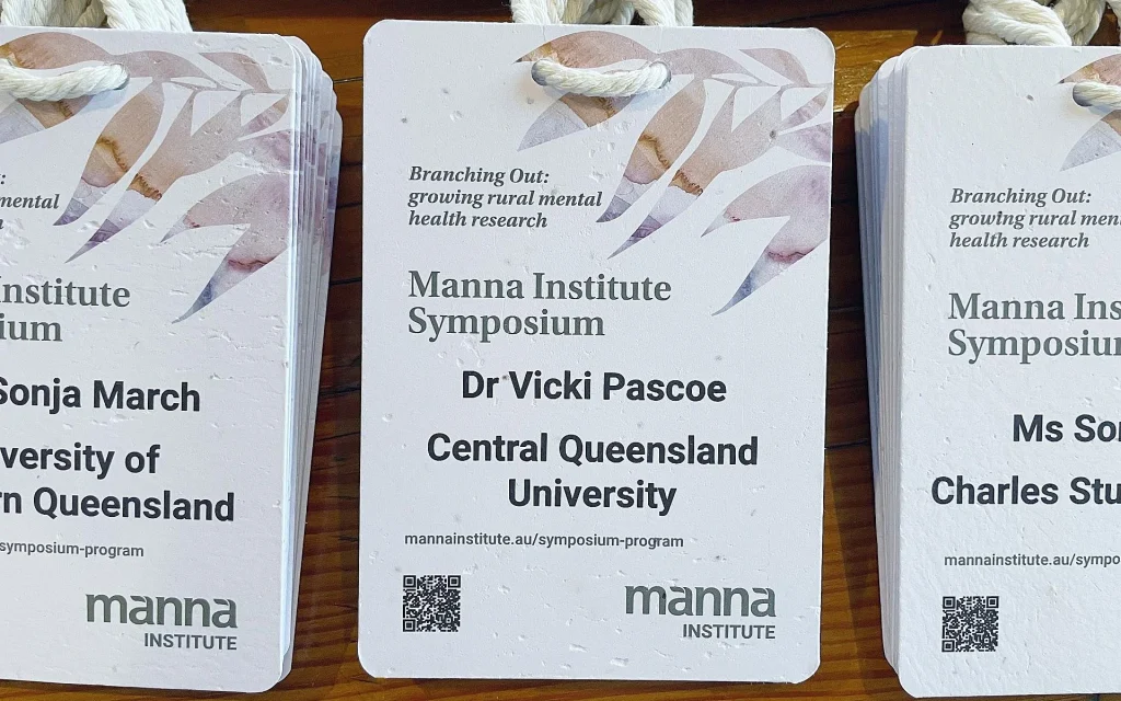
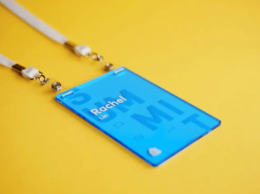
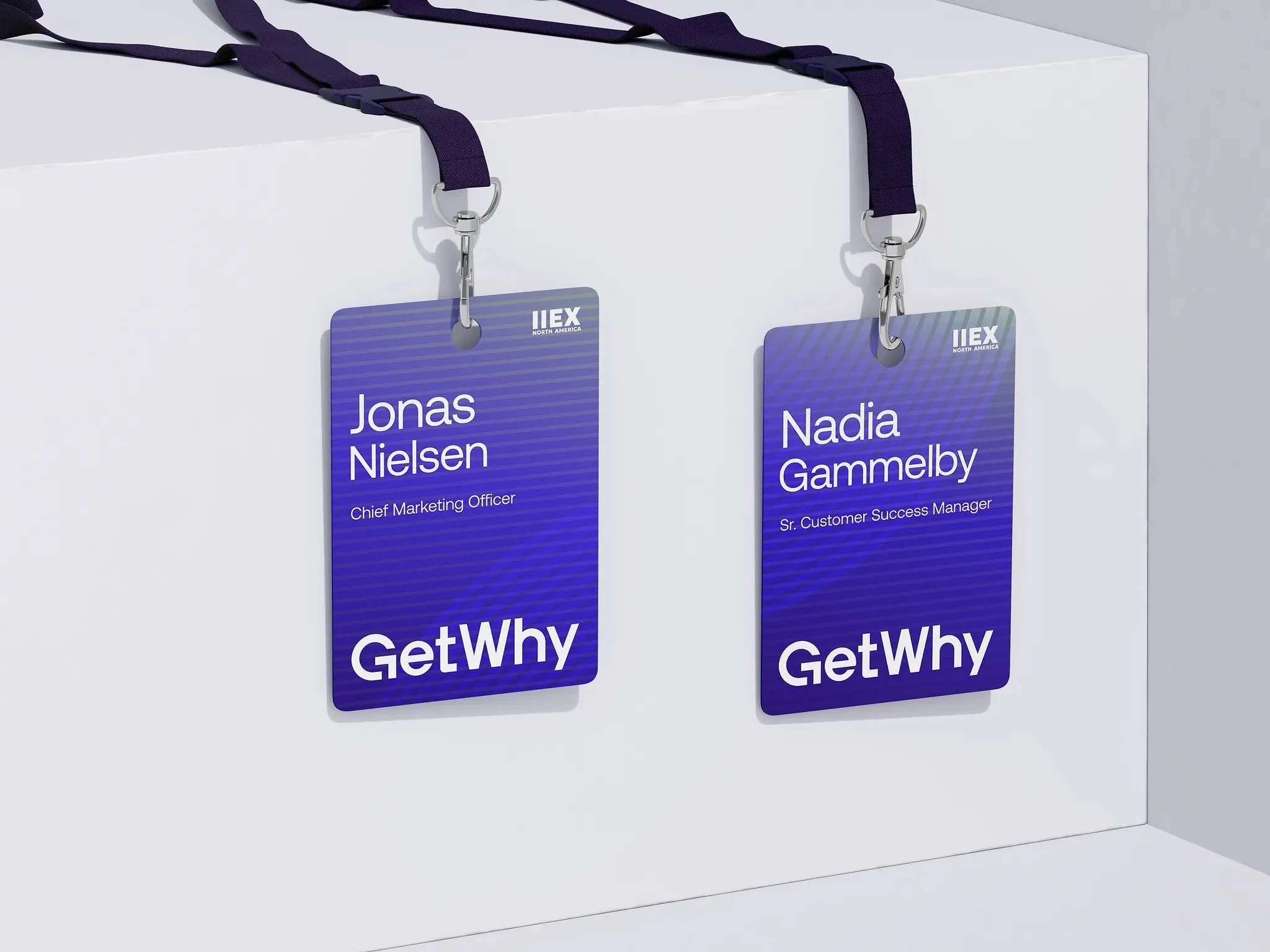
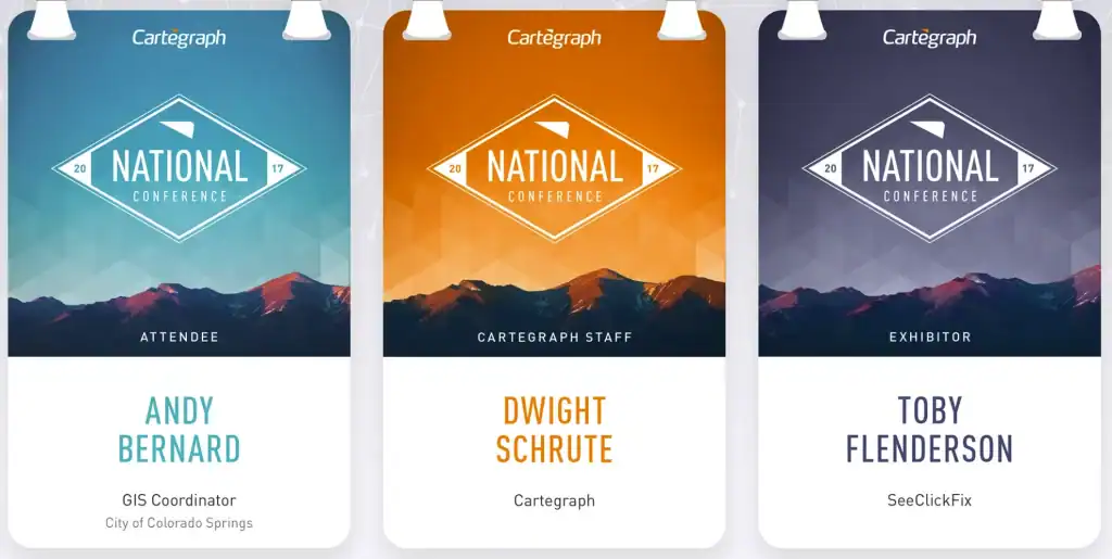
Corporate and Clean
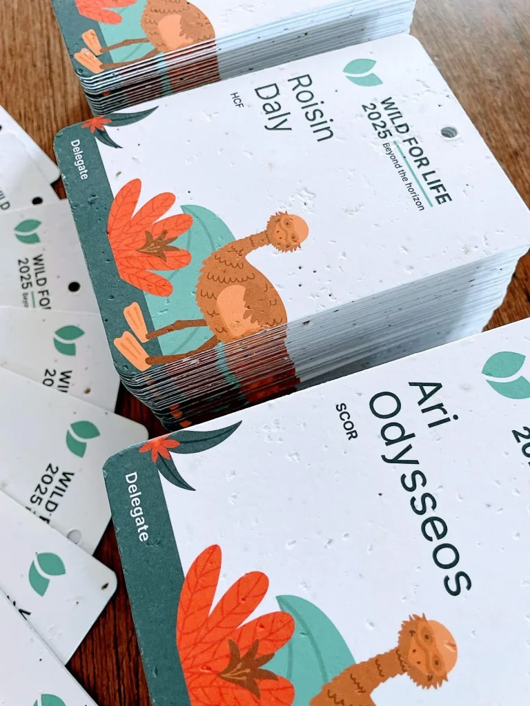
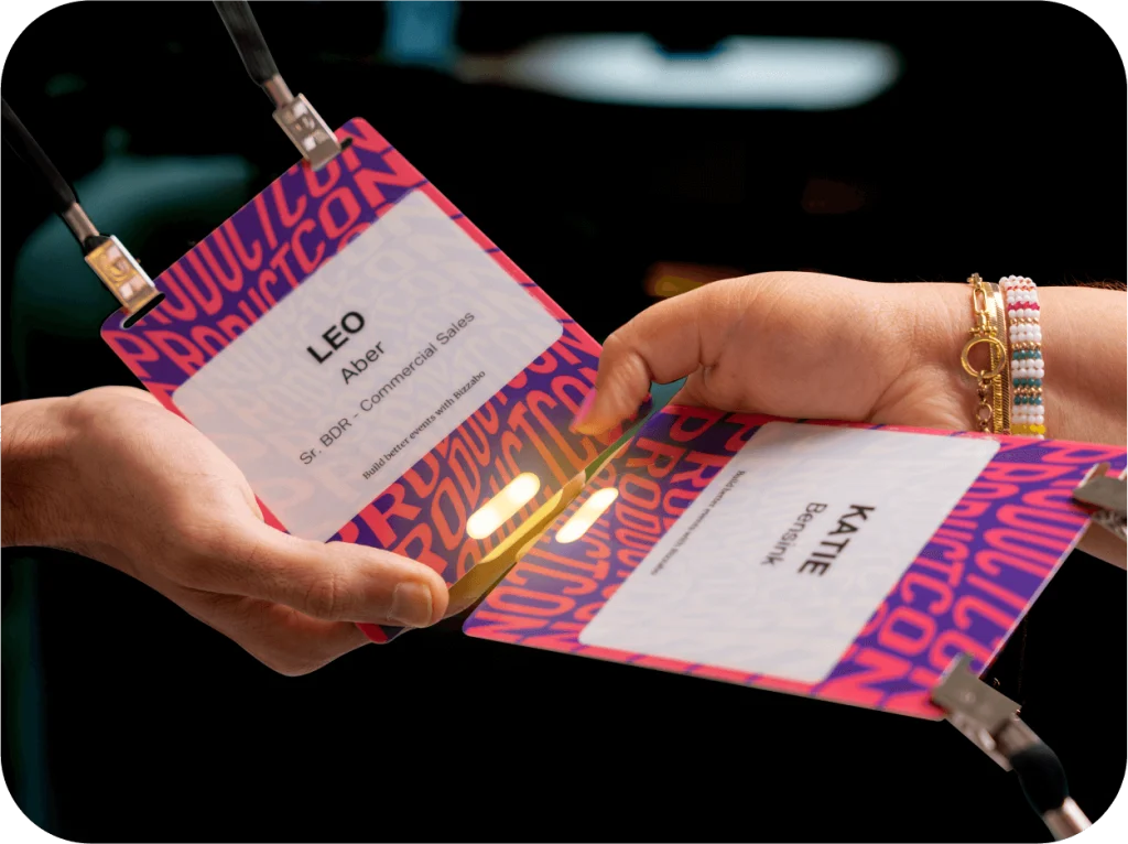
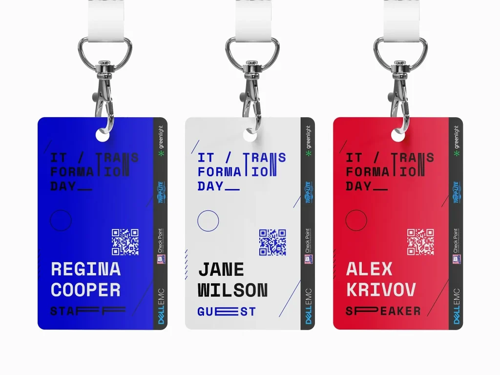
Bold and Branded
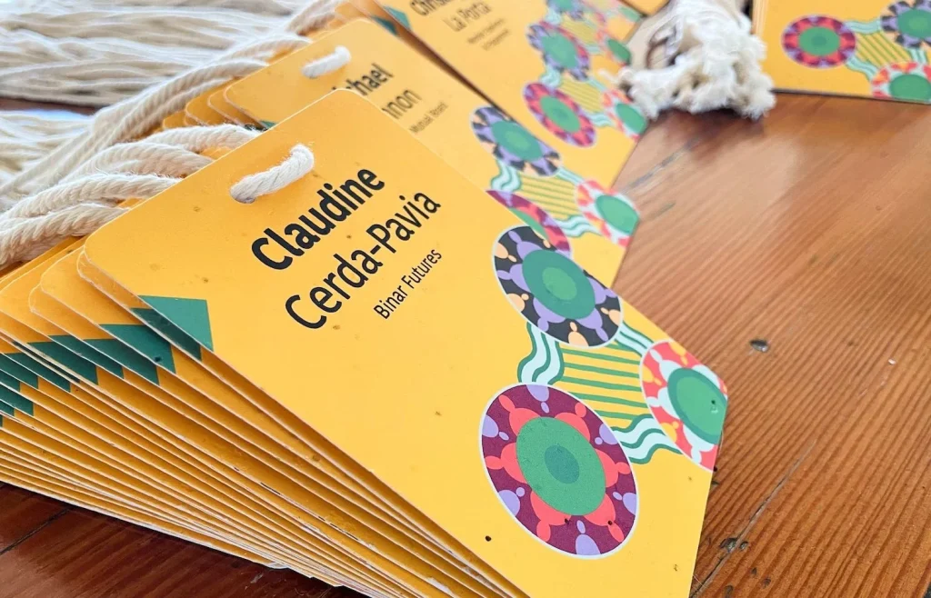
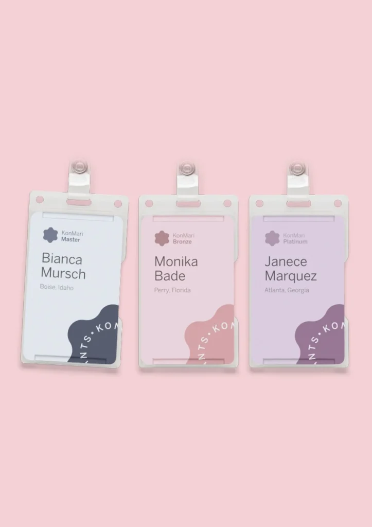
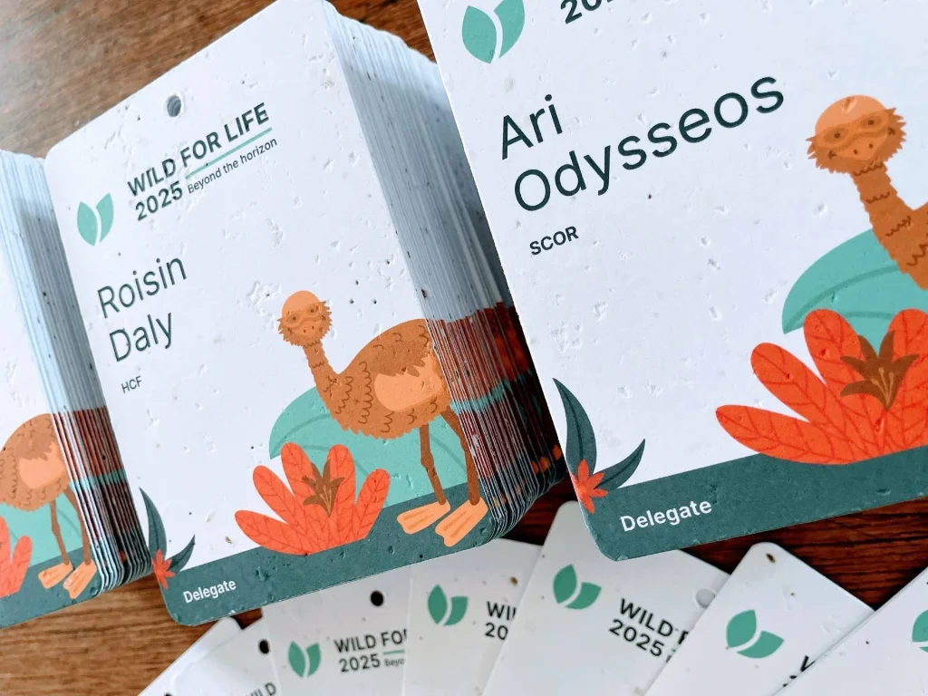
Sustainability Statement
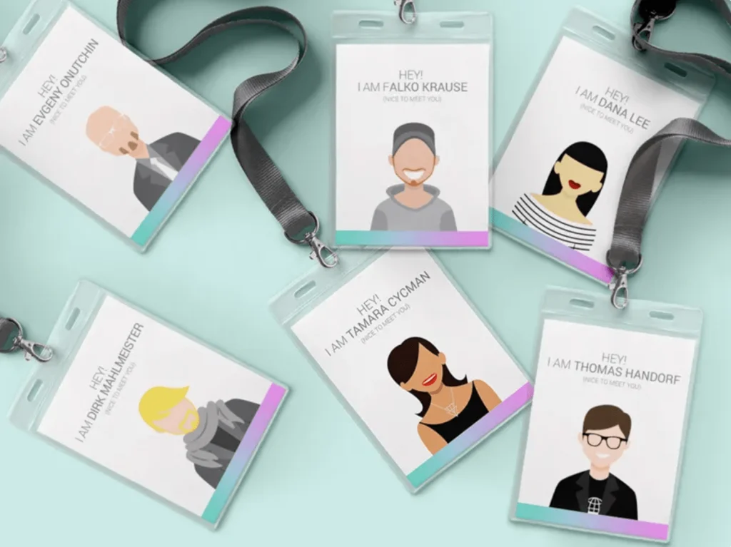
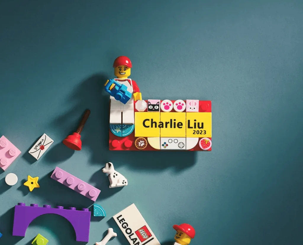
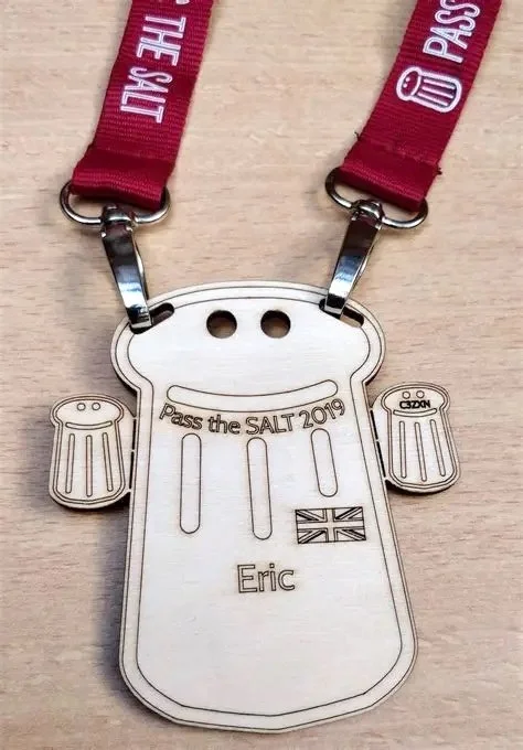
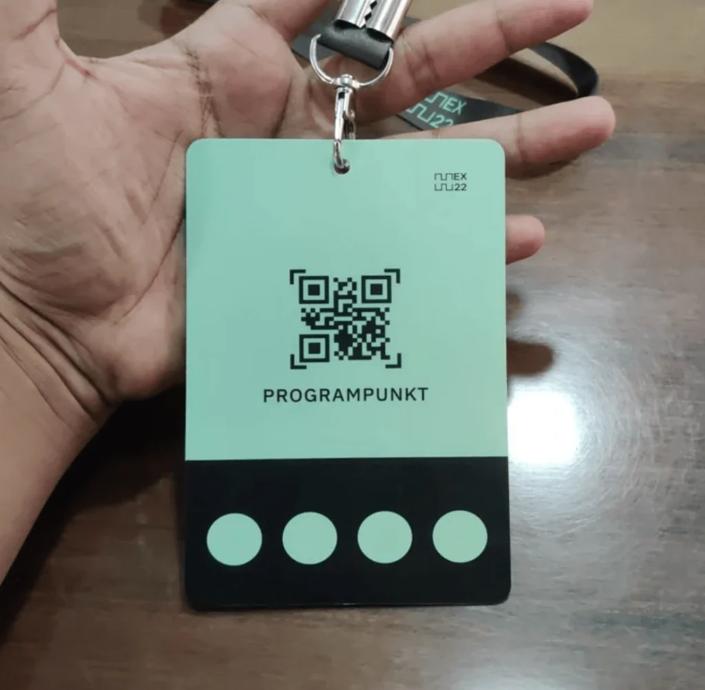
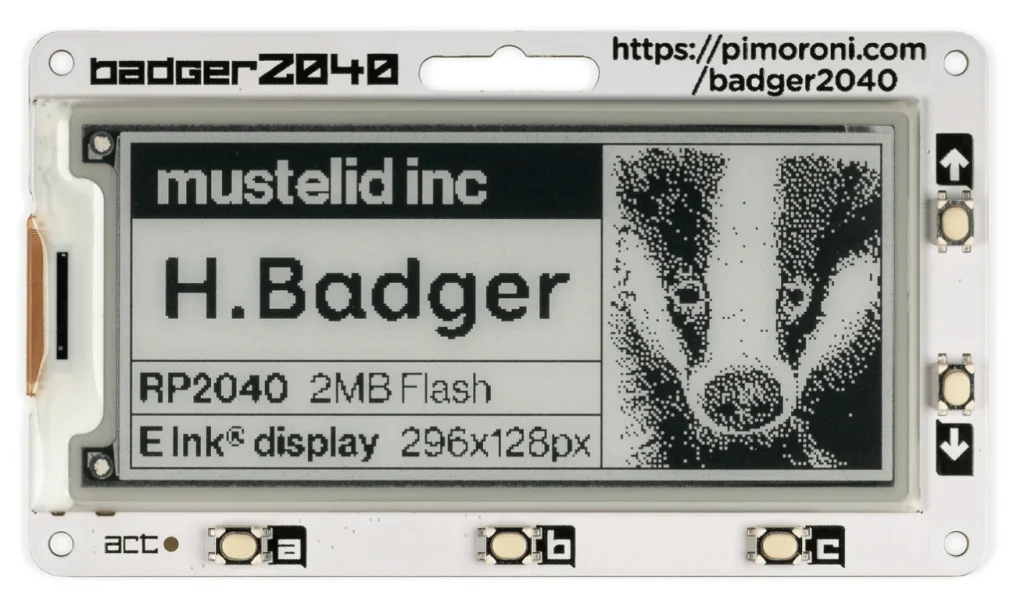
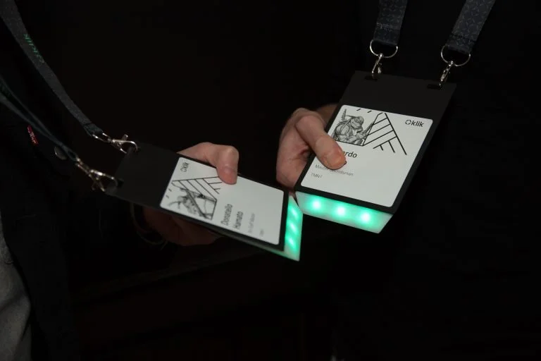
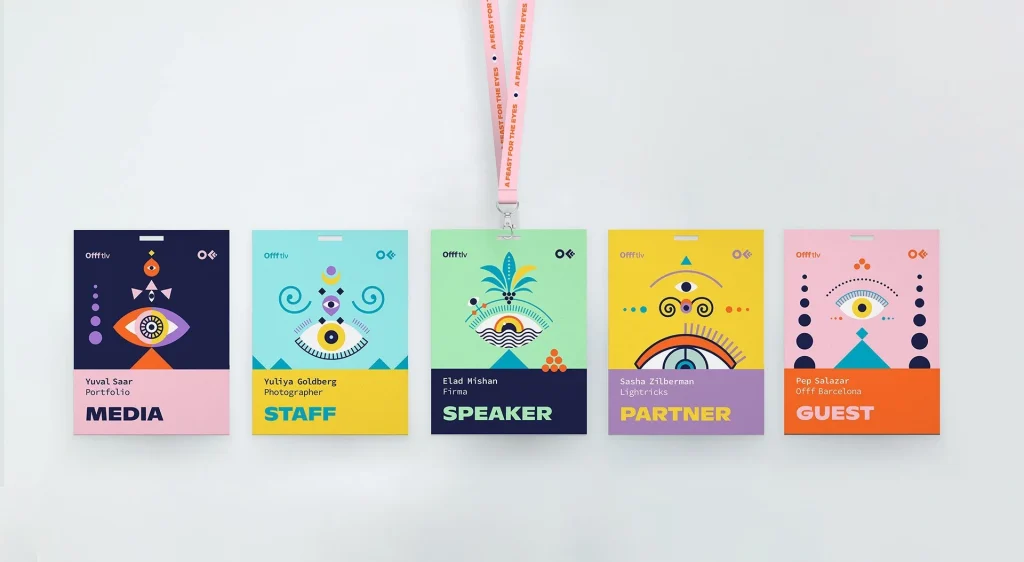
Interactive and Engaging
3. The “How”: Your Complete Step by Step Design Masterclass
This is the tactical, hands on part of the guide. We will walk you through the entire process, from initial strategy to a finished design, ensuring nothing is left to chance.
Part A: The Strategy (Before You Touch Any Software)
A few minutes of planning here will save you hours of frustration later.
Step 1: Master “The Golden Trio” (Core Information)
First, define your information hierarchy. This is the non negotiable foundation for professional name badges at any conference or event.
The First Name (The Hero): This is the star of the show. It must be the biggest visual element. If you cannot read it from 2 to 3 metres away, the badge has failed.
Supporting Info (Company or Job Title): The attendee’s company or job title provides context for conversation. This should be significantly smaller than the first name.
Event Branding: Your event or sponsor logos provide context but should not overpower the attendee’s name.
Step 2: Choose Your Canvas (Size & Orientation)
The name badge dimensions dictate your entire layout. The two industry standards are:
A6 (105 × 148 mm): The conference standard. Ideal if you are including job titles, logos, or QR codes. It gives your event name badge design elements room to breathe and is the safest choice for professional name badges.
A7 (74 × 105 mm): The minimalist choice. Best for sleek, simple event name badges with just a name and company.
Orientation: There is no wrong choice. It comes down to your design. Once you know your size and orientation, you are ready to set up the template.
Portrait (vertical) is great for stacking information such as name, title, company.
Landscape (horizontal) works well for wide logos. There is no wrong choice. It comes down to your design. Once you know your size and orientation, you are ready to set up the template.
Our advice? If you are unsure, start with an A7 template. If the design feels cramped, size up to A6.
Part B: The Execution (Crafting a Visual Masterpiece)
This is where art meets function. Let us build your badge.
Step 3: Command Your Typography
Readability is not negotiable. A beautiful badge that cannot be read is useless.
Font Choice: Choose clean, modern sans serif fonts such as Arial, Helvetica, Lato, Open Sans or Montserrat. They are far easier to read from a distance than decorative, serif or script fonts.
Font Size: The first name should be a minimum of 38 to 48 pt. Supporting text such as job titles can be smaller, but keep them above 14 to 18 pt.
Hierarchy is Everything: Use a clear visual hierarchy on your event name badges. The attendee’s first name should always be the largest and boldest element.
Step 4: Wield Colour with Purpose
High Contrast is a Must: Avoid light text on a light background. Black text on a white or pale background, or white text on a dark background, always performs best.
The Blink Test: Glance at your design for one second and look away. Does the first name stay in your mind? If not, your colour choices are competing for attention.
Step 5: Master the Layout
White Space is Your Best Friend: Do not cram everything together. Space around text helps it breathe. Leave a safe margin of at least 5 mm from all edges.
Balance: A layout can be symmetrical for a formal look or asymmetrical for something more modern and dynamic.
Step 6: Use Our FREE Templates to Get Started
Feeling ready to take control? Our
Name Tag Tools page
has free, editable name badge templates for Word, PowerPoint and Canva, in both A6 and A7 sizes so you can build professional event name badges without starting from scratch.
If it all feels too hard, do not panic.
We have detailed guides on how to create name badges in Word and how to design event badges in PowerPoint. They will walk you through the entire process step by step.
4. The Pitfalls: 7 Deadly Sins of Event Name Badges to Avoid
Avoiding these common mistakes is the fastest route to a better badge.
Unreadable Fonts: Tiny, serif, decorative or low contrast text that forces people to squint.
Lack of Hierarchy: When a massive event or sponsor logo overshadows the attendee’s name. The person is the star.
The Dreaded Badge Flip: Using a single swivelling clip lanyard that guarantees the badge will face backwards all day.
The Ocean of Plastic: Relying on flimsy, single use plastic badge holders and synthetic lanyards that head straight to landfill.
Information Overload: Cramming too much on the front. Keep it simple and scannable.
Ignoring the Check in Chaos: Throwing printed badges in a box creates a registration desk nightmare.
Forgetting the Back: Leaving the back blank wastes valuable real estate for maps, schedules, Wi Fi, key messages or sponsors.
5. The Logistics: From Data Merge to On Site Check In
A great design is useless without flawless execution. This is the part most people forget.
Data Management (The Mail Merge)
Before printing, thoroughly clean your guest list. Standardise capitalisation and check for typos.
Use a mail merge in Word or InDesign to automatically populate your badge template from a spreadsheet.
DIY Printing: Ideal for small events. Use a high quality printer and thick card stock (at least 250 gsm). Be prepared for cutting.
Professional Badge Printing: Essential for larger events. Ensures clean cuts, consistent colour and options like double sided printing for polished event name badges.
On Site Organisation: The Badge Board
The single most efficient way to organise badges during check in.
Lay them out alphabetically on a large table so attendees can spot theirs quickly.
Reduces queues and stress for staff.
Loving the Instructions? Imagine the Full Service
If you want a smoother, more sustainable event, we can handle everything. We will bring your design to life on premium eco friendly materials and deliver ready to wear event name badges to your door.
6. The Deep Dive: Lanyards, Accessibility and True Sustainability
Plantable seed paper conference badges
A Guide to True Sustainability: How to Spot and Avoid Greenwashing
As a conscientious event planner, you want to make responsible choices. The challenge is that the market is filled with confusing eco claims designed to mislead. Here is a fact based look at the materials behind some common event name badges.
A Fact Check on Tyvek® Badges
The Claim: A durable, water resistant and recyclable alternative to paper.
The Facts:
It is plastic: Tyvek is made from one hundred percent high density polyethylene, also known as HDPE.
It is not kerbside recyclable: Tyvek cannot go into standard recycling bins. Its manufacturer DuPont confirms that doing so can contaminate the recycling stream. It requires a specialist mail back program that is impractical for most event organisers.
The Truth About “Eco” Bamboo Badges
The Claim: A natural, biodegradable badge made from bamboo.
The Facts:
It is a composite: These products are made by mixing bamboo powder with a plastic resin binder, most commonly melamine formaldehyde.
It is not recyclable or biodegradable: The resulting composite can neither be recycled nor will it biodegrade.
“These products are not safe and are not recyclable or biodegradable. They should be disposed of in general waste.”
The Reality of PET Plastic Badges
The Claim: An eco friendly badge made from a commonly recycled plastic.
The Facts:
Event recycling is incredibly inefficient: While PET can be recycled, the infrastructure at most events is poor. Contamination rates are high and it is common for these so called recycling bins to all be sent to the same landfill.
The Bottom Line: The most genuinely sustainable choices are materials that are easily and widely recyclable, such as one hundred percent uncoated paper, or naturally biodegradable materials such as our seed paper, which returns to the earth as flowers.
7. The Smart Buy: How to Brief a Professional
Decided to outsource? Excellent choice. To get exactly what you want, give your supplier a clear brief for your custom name badges and event name badges.
Your brief should include:
Event details: Event name, date and number of attendees.
Design vision: Your logo in vector format and brand colours.
Required information: Every field you need on the badge.
Badge and lanyard specs: Badge size, material such as recycled paper or seed paper, and lanyard type, for example “twenty millimetre recycled PET with dual clips”.
Data file: A finalised, clean spreadsheet of attendee names, where column A is first name, column B is last name and column C is organisation.
Delivery details: The delivery address and deadline, plus a clear note that you want badges fully assembled and sorted alphabetically.
Your Pre Print Panic Questions Answered
You have designed the badge, but the what ifs are creeping in. Here are the real world questions our clients ask and our honest answers.
1. “I do not have Adobe software. Can I really design event name badges that don’t look cheap?”
The short answer: Absolutely.
The long answer: A professional look comes from good principles, not fancy software. A clean layout, high contrast colours and a single readable font in Word, PowerPoint or Canva will outperform a cluttered, multi font design created in Adobe Illustrator. This guide is written specifically with you in mind.
2. “How do I convince my manager that quality, sustainable badges are worth the cost?”
The short answer: Frame it as brand investment, not a logistics expense.
The long answer: Ask your manager, “Do we want our brand’s first physical touchpoint at this event to feel cheap?” Flimsy plastic event name badges quietly signal that your organisation cuts corners. Quality, sustainable event name badges tell people you are thoughtful, professional and aligned with modern values. It is not just a name tag. It is a piece of your brand’s reputation that every single attendee wears.
3. “My boss just handed me a last minute list of VIPs. How do I handle them without chaos?”
The short answer: Use the blank badge strategy.
The long answer: Never print only the exact number of badges you think you need. Always print an extra five to ten percent with the background design but no name. When a VIP appears, you can use Word and Avery eco labels to print their name, or handwrite it neatly with a quality black marker. The blank badge is your secret weapon.
4. “Our sponsors are demanding bigger logos. What do I do?”
The short answer: Gently bring them back to visual hierarchy.
The long answer: Explain that the event name badges design’s primary job is to support networking for the attendee. If a sponsor logo dominates the design and overpowers the name, the badge fails for everyone. Reassure them that their logo is prominent in its own space, such as a sponsor bar, and that making it even larger would undermine the professional experience for attendees, which ultimately reflects poorly on the sponsor too.
5. “What should we tell attendees to do with event name badges afterwards?”
The short answer: Give them a clear, simple end of life plan.
The long answer: This is a big opportunity to show that you are thoughtful. If you have used our seed paper badges, you can happily say, “Take them home and plant them.” If you have used recyclable paper, provide clearly marked collection bins at the exit. The worst option is silence, leaving attendees unsure and guilty about putting branded material in the bin.
You Are Ready to Create Event Name Badges That Connect, Not Annoy
You now have a complete strategic framework for designing, producing and managing your event name badges. By moving beyond simple design and considering the entire lifecycle, from data right through to disposal, you can create custom name badges and professional name badges that enhance your event, reinforce your brand and remove a huge amount of stress.
If you want to make it even easier, we are here to help. At Terra Tag, we handle everything, from design through to delivering your badges fully assembled and alphabetised.
When you are ready to upgrade your conference name badges, our seed paper and recycled paper options give you professional event name badges without the plastic guilt.
Rhonda Sweet has overseen the design and production of more than 130,000 conference badges across corporate, government, university, and research events in Australia. She is the founder of Terra Tag and formerly a strategic designer and ethnographic researcher with experience at Bain, Westpac, and McKinsey.
By using this website, you agree to our use of cookies. We use cookies to provide you with a great experience and to help our website run effectively.
This website uses cookies
Websites store cookies to enhance functionality and personalise your experience. You can manage your preferences, but blocking some cookies may impact site performance and services.
Essential cookies enable basic functions and are necessary for the proper function of the website.
Name
Description
Duration
Cookie Preferences
This cookie is used to store the user's cookie consent preferences.