
Badge Typography: How Font Size & Style Impact Readability at 3 Meters
First impressions at events are shaped by clarity and ease of identification. Badge typography, specifically font size and style, profoundly impacts networking effectiveness, event inclusivity, and the overall attendee experience. Understanding how typography influences readability at a distance can significantly enhance the functionality and aesthetics of event badges.
Why Badge Readability Matters
Clear badge design ensures attendees can easily read names and affiliations, reducing social barriers and facilitating smoother interactions. Poorly designed badges create frustration, impair accessibility, and hinder effective networking.
The Science Behind Typography and Cognitive Ease
Human eyes and brains rapidly process visual stimuli through pattern recognition. Cognitive ease—the speed and simplicity with which information is processed—is significantly influenced by typographic choices, including font size, style, contrast, and layout. Typography that promotes cognitive ease enables quicker recognition, comprehension, and memorability.
How to Choose Badge Font Sizes
Empirical Rules
Minimum readable font size at 3 meters: 36-38pt (primary name).
Secondary information (job titles, companies): 24-30pt.
Additional info (pronouns, locations): Minimum 20pt.
Large vs Small Event Best Practices
Large events: Prioritise larger font sizes and streamlined information.
Smaller events: More detailed information is acceptable, provided minimum sizes are maintained.
Typeface Selection: What Works and What Doesn’t
Sans-serif vs Serif Fonts
Sans-serif fonts (Arial, Helvetica, Roboto): Ideal for badges due to clean lines and improved distance readability.
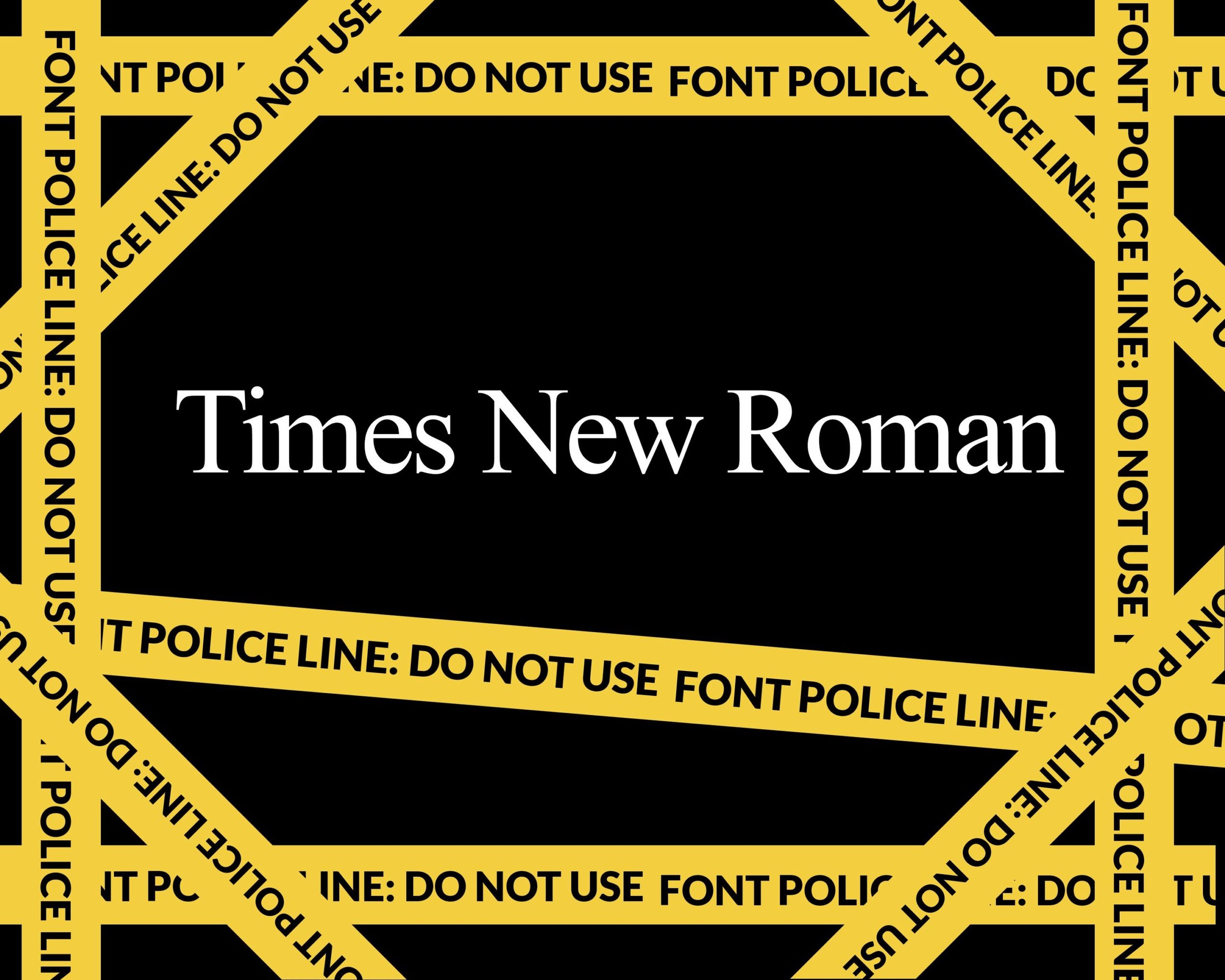
Serif fonts (Times New Roman, Georgia): Less suitable, as decorative strokes (serifs) can impair quick visual processing from a distance.
Decorative Fonts
Use sparingly: Highly stylised fonts sacrifice readability. Reserve decorative fonts for limited branding use, ideally on badge backs or large format areas.
Brand Integration Without Sacrificing Readability
Incorporate brand identity subtly through colour, placement, and typography choices aligned with readability. Prioritise legibility over decorative branding.
Colour Contrast and Backgrounds
Effective contrast significantly enhances readability:
High contrast combinations (black text on white background, dark navy on pale yellow) perform best.
Low contrast pairs (light grey on white, yellow on white) impair legibility.
Recommended contrast ratio: At least 4.5:1 (WCAG 2.1 standard).
Badge Layout and Visual Hierarchy
Clearly guide the viewer's eye:
Primary element: First name, prominently placed and largest.
Secondary elements: Job title, organisation, smaller but clear.
Additional elements: Pronouns or icons placed neatly to avoid clutter.
QR codes/logos: Positioned discreetly or on the badge reverse.
Accessibility Considerations
Design badges inclusive of all attendees:
Contrast ratios: Adhere to WCAG 2.1 guidelines (minimum 4.5:1).
Dyslexia-friendly fonts: Consider OpenDyslexic or simpler fonts like Arial or Verdana.
Multi-lingual events: Ensure clear, universally legible fonts; avoid fonts with culturally ambiguous characters.
Common Mistakes to Avoid
Font size too small: Compromises legibility from a distance.
Overcrowded information: Reduces cognitive ease and clarity.
Poor print quality: Impairs even the best typography choices. Always select high-quality printing methods.
How Terra Tag Optimises for Readability
Terra Tag champions readability through deliberate design:
Material choice: Ensures vibrant colour reproduction and sharp printing.
Font guidance: Clients advised on optimal typography—sans-serif, clear hierarchy, and minimum size recommendations.
Practical sustainability: Eco-friendly badges, like those for Tourism Australia (72kg CO₂ saved, 600 badges), Bloomberg (60kg CO₂ saved, 500 badges), and Nando's (54kg CO₂ saved, 450 badges), blend environmental responsibility with readability excellence.
FAQs Section
What is the minimum font size for badge readability? At least 36-38pt for primary names viewed at 3 meters.
Why are sans-serif fonts recommended? They offer better legibility at a distance, reducing visual processing effort.
What is the recommended contrast ratio for badges? A minimum 4.5:1 contrast ratio, as per WCAG 2.1.
Effective typography in badge design is critical for event success. Understanding font size, style, and visual processing ensures badges not only enhance attendee interactions but also reinforce event inclusivity. By prioritising readability, event organisers can deliver a superior, memorable experience for every participant.