
How To Design Event Name Badges (that don’t suck)
Updated June 28, 2025

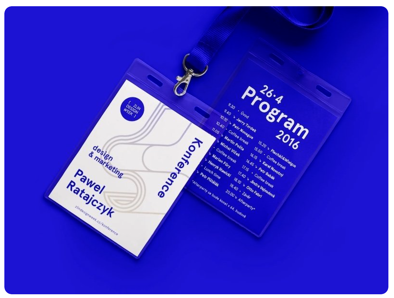
Credit: Software Mansion
We’ve all been there. You’re at a conference in Sydney, trying to network, but you end up squinting at someone’s chest, trying to decipher a name badge that looks like it was designed in a spreadsheet five minutes before doors opened.
Awkward 😬.
Poorly designed name badges lead to confusion and missed connections. And in 2025, a badge made of plastic feels just as out of place.
This is your definitive guide to fixing all of that. We’ll walk you through a simple, step-by-step process for creating a badge that is visually stunning, easy to read, and—most importantly—made from materials you can be proud of. Whether you're an EA, office manager, event planner or comms lead, this is your playbook for creating badges that stand out for all the right reasons.

Credit: Julia Marsh
Part 1: The Strategy (Before You Touch Any Software)

A few minutes of planning here will save you hours of frustration later.
Step 1: Master "The Golden Trio" (Core Information)
First, define your hierarchy. What absolutely must be on the badge?
The First Name (Hero)
This is the star of the badge. It must be the biggest element — that’s why it’s called a name badge. If you can’t read it from a few metres away, it’s failed its job.Supporting Info (Last Name + Job Title + Company)
The last name, job title, and organisation go underneath in smaller fonts. People care about who you are first, what you do second, and where you’re from third.Event Branding
The event’s logo and title can sit smaller again. It’s there, but it’s not the main act.
*Design Rule of Thumb: If you have to squint to read the name, it's not big enough. Print a test, stick it on the wall, and walk back 2-3 meters. Can you still clearly read the first name?
While designing your badges, you might also consider the etiquette of wearing them. Check out our post on Name Badge Etiquette for tips on placement and usage (because a great badge design still needs to be worn the right way!)
Step 2: Choose Your Canvas (Size & Orientation)

Credit: Vlad Radchenko
Size dictates everything. The two industry standards offer different advantages:
A6 (105 x 148 mm): The Conference Standard. Ideal if you're including job titles, logos, or QR codes. It gives your design elements room to breathe.
A7 (74 x 105 mm): The Minimalist Choice. Best for sleek, simple designs with just a name and company.
Our advice? If you're unsure, start with A7. If the design feels cramped, size up to A6.
For orientation, Portrait (vertical) is great for stacking info (Name, Title, Company), while Landscape (horizontal) works well for wide logos. There’s no wrong choice. It comes down to your design. Once you know your size and orientation, you’re ready to set up the template.
If it all feels too hard …
Ditch the instructions and get our free name badge templates from our Name Tag Tools page.
Part 2: The Design (Crafting a Visual Masterpiece)

Credit: Punch
This is where art meets function. Let's build your badge.
Step 3: Command Your Typography
Readability is not negotiable.
Font Choice: Opt for clean, modern sans-serif fonts like Arial, Helvetica, Lato, Open Sans or Montserrat. They are infinitely easier to read from a distance than decorative or script fonts.
Font Size: The First Name should be a minimum of 38-48pt. Supporting text like job titles and company names can be smaller, but keep them above 14-18pt.
Hierarchy is Everything: Use a clear visual hierarchy. The attendee’s FIRST name should be the largest and boldest. Their last name, job title and company should be in smaller, secondary text. This creates a clean, organised look that the brain can process in an instant.

Credit: EvenSix
Step 4: Wield Colour with Purpose
Colours evoke emotion, but their primary job here is to aid communication.
The Psychology of Colour: If you have a brand palette, that’s what you lead with. If you don’t, remember that your choices send a subconscious message. Blue inspires tranquility and trust (perfect for corporate or government events), while yellow conveys happiness and green signals nature and health (ideal for wellness or sustainability forums). Choose a palette that complements your event's theme.
High-Contrast is a Must: This is where most DIY designs fail. Avoid light text on a light background or dark text on a dark background. The best combinations are classic for a reason: black text on a white/light background, or white text on a dark one.
The Blink Test: Glance at your design for one second, then look away. Do the key details—especially the first name—stick in your mind? If not, your colours might be distracting from the core information.

Credit: Conduit Studio
Step 5: Master the Layout (Balance, Space, and The Dreaded Lanyard Flip)
How you arrange elements is as important as the elements themselves.
It Hangs in the Balance: A great design is visually harmonious.
Symmetrical balance (mirroring elements on either side of a central line) creates a formal, orderly look.
Asymmetrical balance (using different but complementary elements) offers a more dynamic, modern feel. A government seminar might favour symmetry, while a creative industry meetup could embrace asymmetry.
White Space is Your Best Friend: Don’t cram everything together! Empty space around your text and logos is what makes them stand out. Avoid overcrowding one area, and ensure a "safe margin" of at least 5mm from all edges.
The Lanyard is Half the Experience
You wouldn't put cheap tires on a luxury car. Don't pair your beautiful badge with a cheap, scratchy lanyard.Material Matters: A soft, natural fiber lanyard (like cotton or bamboo fiber) feels much more premium than a shiny, synthetic nylon one that ends up in landfill for 500 years (yep … it does).
The Clip Matters: A dual-clip lanyard is the gold standard for preventing the dreaded badge-flip. A single clip that swivels is a recipe for a constantly backward-facing badge.
Width Matters: A slightly wider lanyard (e.g., 20mm vs 10mm) often hangs better and provides a more substantial feel.

Credit: Olena Tulainova
Step 6: Integrate Sponsors & Tech Gracefully
Sponsor logos and QR codes can be powerful additions if handled correctly.
Sponsor Logos: Don’t Let Them Steal the Show. Acknowledge your sponsors by placing their logos in a designated "sponsor bar" at the bottom of the badge. Remember the visual hierarchy: the attendee is the star, your event is the host, and sponsors are valued supporters.
QR Codes: Make them Scan-tastic. A QR code linking to an event schedule or speaker bios is a great, paper-saving feature. Place it in a bottom corner or on the back. Provide a brief instruction like "Scan for Agenda" so attendees know its purpose.

Credit: Walnut Creek Creative
Step 7: The Overlooked Details That Make or Break the Experience
A perfect badge can be let down by poor planning. Here are the three non-design details that separate the pros from the amateurs.
1. The "What to Leave OFF" Checklist
The #1 design mistake is clutter. Before you finalise, ask yourself if you can remove any of the following:
The Job Title? For many networking events, just the company name is enough to start a conversation and saves a ton of space.
Multiple Sponsor Logos on the Front? Can they go on the back instead?
The Full Event Schedule? A QR code linking to a digital agenda is much cleaner and more practical.
Unnecessary Graphics or "Swooshes"? Does that flourish add value, or just noise? When in doubt, take it out.
2. The Check-in Flow: The Final Hurdle
Your work isn't done until the last guest has their badge. How you organise them for check-in is critical.
Don't Bring a Box of Chaos. The absolute worst experience is a staff member frantically digging through a cardboard box of tangled badges.
The Pro Method: The Badge Board. Lay all badges out, alphabetically by last name, on a large table. This "badge board" allows staff to find a guest's name in seconds. It looks incredibly professional, reduces queue times to almost zero, and makes for a calm, welcoming start to your event.
Want the ‘super-dooper’ indepth design guide to conference name badges?
Check out How to Nail Conference Name Badge Design (Without Tanking Your Cred)

Credit: Tyler LaCross
Steal Part 3: The Material & The Message (Beyond the Design)
Step 8: Put Real Effort In (Because F-Ugly Need Not Apply)
No one wants to wear something that looks like an afterthought. Your guests have made an effort to attend—travelling, dressing up, taking time out. Match that effort with a stunning name badge. A cheap-looking, flimsy tag sends the wrong message. A well-designed, quality badge shows you care and makes people proud to wear it.

Sustainable badges in action: Terra Tag’s seed paper name tags and natural fiber lanyards. These plantable badges biodegrade (and even grow native wildflowers) instead of ending up in landfill.
Step 9: Keep It Green (And Ditch the Fake Eco-Badges)
Your guests don’t want a plastic name badge holder. In 2025, handing out single-use plastic looks dated and out of touch. People are aware of the environmental toll, and nobody wants to feel guilty about a piece of trash with their name on it.
But beware of greenwashing. Many so-called "eco" alternatives are just as bad:
Bamboo Badges: Usually made from bamboo dust mixed with plastic resin. They are not biodegradable or recyclable.
"Pocketless" PET Badges: Still plastic. Requires specialist recycling that rarely happens.
Tyvek: A durable plastic that cannot go in standard recycling bins and requires a mail-back program with very low participation rates.
The truly sustainable choice is beautiful, honest paper.
100% Recycled Paper shows a commitment to the circular economy.
Seed Paper is the ultimate conversation starter. Our badges are embedded with native seeds and can be planted after the event to grow wildflowers.
By choosing materials like these, you're sending a message that you care. It’s a small change that significantly reduces waste and makes a big impression.
Loved the Instructions? Imagine the Full Service.
You now have the complete playbook to design an incredible name badge. If you're ready to make your event even easier and more sustainable, let us handle the rest. We’ll bring your brilliant design to life, printed on materials you can be proud of, and deliver them to your door ready to wear.
Get an Instant Quote & Make Your Event One to Remember
Your Pre-Print Panic Questions Answered
You've designed the badge, but now the "what ifs" are creeping in. Here are the real-world questions our clients ask, and our honest answers.
1. "I don’t have Adobe software. Can I really make something that doesn't look cheap?"
The Short Answer: Absolutely.
The Long Answer: A professional look comes from good principles, not fancy software. A clean layout, high-contrast colors, and a single, readable font in Word, PowerPoint or Canva will look a thousand times better than a cluttered, multi-font mess created in Adobe Illustrator. This guide is designed specifically for you.
2. "How do I convince my manager that quality, sustainable badges are worth the cost?"
The Short Answer: Frame it as brand investment, not a logistical expense.
The Long Answer: Ask your manager: "Do we want our brand's first physical touchpoint at this event to feel cheap?" A flimsy, plastic badge subconsciously says your organisation cuts corners. A quality, sustainable badge says you are thoughtful, professional, and aligned with modern values. It’s not just a name tag; it's a piece of your brand's reputation that every single attendee wears.
3. "My boss just handed me a last-minute list of VIPs. What's the best way to handle them without chaos?"
The Short Answer: The "Blank Badge" strategy.
The Long Answer: Never print the exact number of badges you need. Always print an extra 5-10% with the background design but no name. When a VIP is added, you can use Word and Avery labels to print or handwrite their name beautifully with a quality black marker. The blank badge is your best friend.
4. "Our sponsors are demanding their logos be bigger. What do I do?"
The Short Answer: Politely refer them back to the visual hierarchy.
The Long Answer: Explain that the badge's primary function is networking for the attendee. If a sponsor's logo is so large that it overpowers the attendee's name, the badge fails for everyone. Reassure them their logo is prominent in its designated space (e.g., a "sponsor bar") but that making it larger would detract from the professional experience for all attendees—which ultimately reflects poorly on the sponsor, too.
5. "What do we actually tell attendees to do with the badges after the event is over?"
The Short Answer: Give them a clear, simple "end-of-life" plan.
The Long Answer: This is a huge opportunity to show you're thoughtful. If you've used our seed paper badges, you can joyfully tell people, "Take them home and plant them!" If you've used recyclable paper, have a clearly marked collection bin at the exit. The worst thing is to say nothing, leaving attendees to feel guilty about throwing a piece of branded material in the bin.